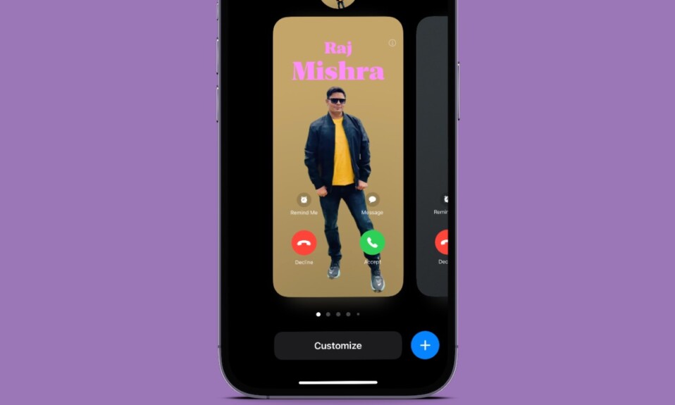
Say “Hello” to the more customizable and fascinating looking “Contact Poster” and “Goodbye” to the old-fashioned tiny contact card. Right from the onset when Apple showcased this all-new iOS 17 feature, I found it noteworthy. The other day, while making a poster, I stumbled upon a handful of hidden filters.
The best part about them is the ability to seamlessly blend with a poster and give it a more attractive look without destroying the quality of the image. With that said, let me show you how to make your iPhone contact poster more attractive using a variety of high-quality filters.
Style Your iPhone Contact Poster With Awesome Filters
Frankly speaking, I don’t prefer to use filters as they tend to destroy the quality of an image. So, when I came across the poster filters, I was a little apprehensive about giving them a try thinking it would either beautify the image or jeopardize the quality. However, it turned out to be completely opposite – much to my surprise.
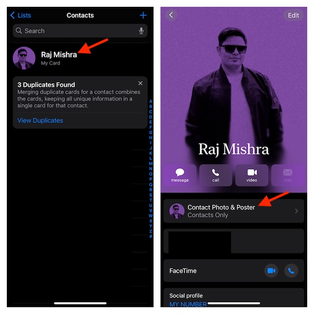
- To begin with, open the Contacts app on your iPhone.
- Now, tap on your Contact Card to proceed.
- Next, choose the Contact Photo & Poster option.
- Next up, tap on the “Edit” button below your current contact poster.
- Up next, you can swipe to find the preferred poster that you would like to customize.
- Then, tap on the Customize button and choose “Poster” in the popup menu.
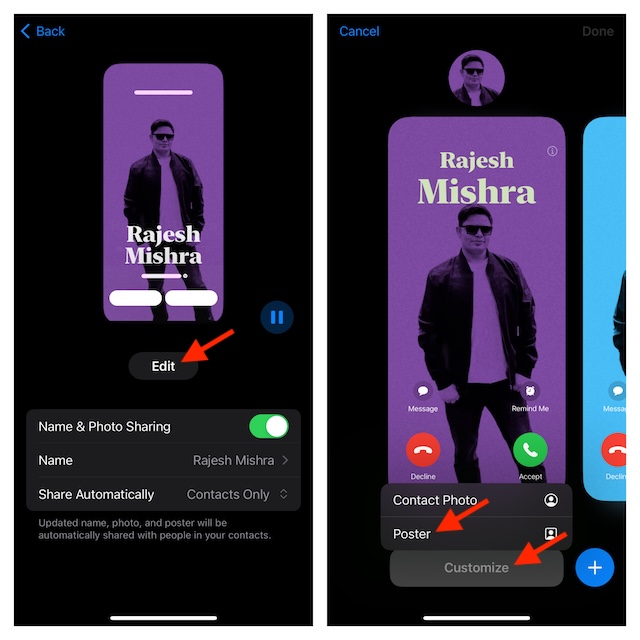
- Now, you can swipe left or right on the screen in order to cycle through the available filters such as Studio, Balck & White, Color Backdrop, Duotone, Color Wash, Overprint, Seamless Background Mono, Seamless Background, Gradient Background, and Natural.
- If you want to take the customization to the next level, you can tap on your name to bring up the font and color menu -> then choose the desired font/color and fine-tune the intensity. And, if you would like to change the background of the image, tap on the tiny circle at the bottom and then select the preferred background color. Note that there is also a way to crop the image through the pinch gesture. Just pinch in and out on the image to crop and adjust it.
- Once you have selected the desired filter, tap in the Done button at the top right corner of the user interface.
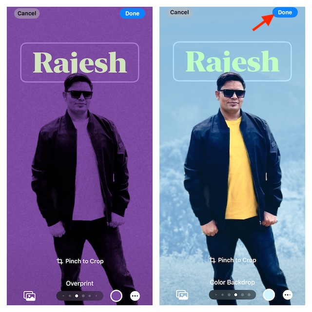
- When prompted, make sure to confirm the changes and that’s about it!
So, that’s how you can amp up the style quotient of your iPhone contact poster. I hope your contact poster will no longer look boring. Have you any valuable feedback for us? If yes, make sure to shoot it via the comments section below.
